––––– UX|UI case study · 10 min read
E-commerce-case study
for the P&C Luxury Segment
––––– My Role: Product designer
UX/UI Design
High-fidelity Prototyping
User research
––––– Deliverables
High-Fidelity Prototype
User research, testing,reports
User flows, journeys, etc.
––––– Tools Used
Figma
Miro
ProtPie
Dovetail
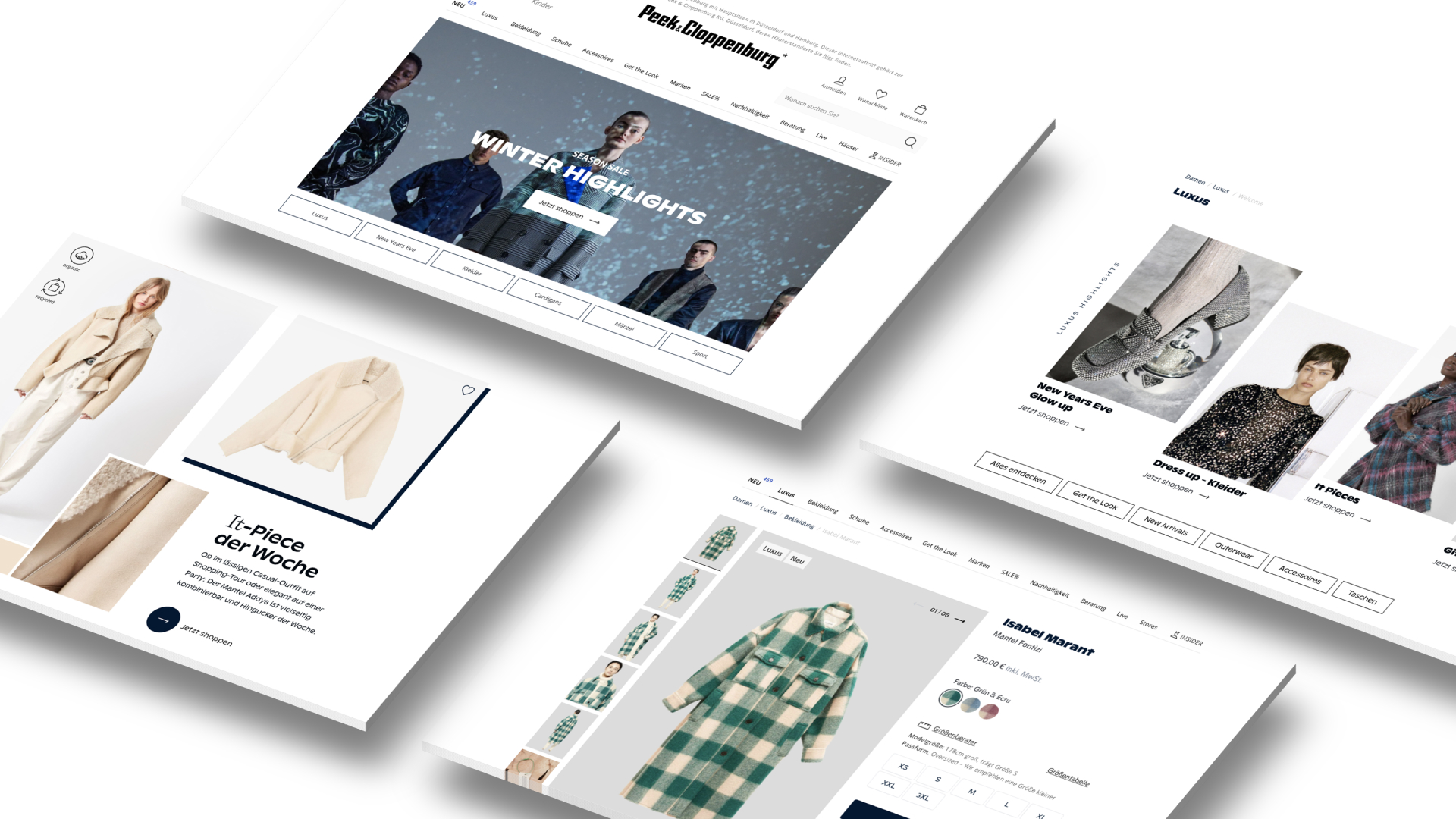
Some designed views
––––– Summary
Together with my Team and my co-designer Carina, we built an interactive prototype and conducted primary research to gain insights into changing consumer patterns concerning high fashion.
––––– Background
ABOUT TRADING UP
We built a desktop web-based prototype that focused on the presentation of luxury brands. The intent was to enable our users to dive deeper into the world of high fashion. Hence, users were taken on an inspirational journey within the legacy environment of Peek & Cloppenburg Düsseldorf. For this project, we followed the Design Thinking framework as it helped us to both identify problems and find solutions faster. The project was kicked off via a Design Studio Workshop in which experts from Shop Management, Procurement, Brand, CRO, and UX were gathered under "one roof". This cross-functional team was responsible for defining user and business pain points, the new target group, and ways to improve the attractiveness of the luxury segment.
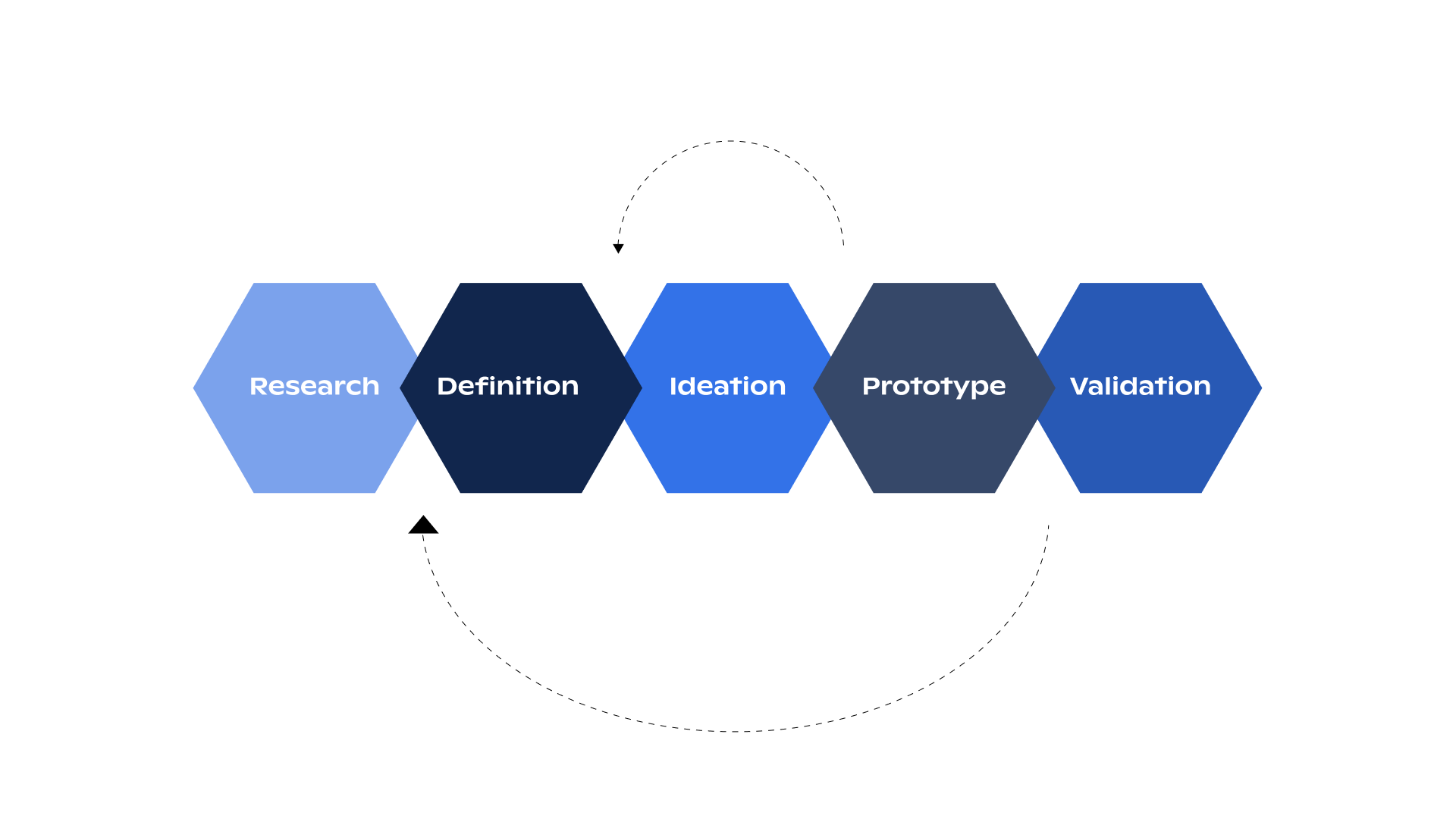
Design Thinking Framework
––––– Challenge&Problem
CHANGING CUSTOMER BUYING BEHAVIOUR
Looking at the status quo, we found that there has been a decline in premium brands within the last couple of years. Most premium brands offered by P&C* can also be found elsewhere. As a consequence, we lose valuable customers since they can purchase those products also from our competitors. In addition to that, further market research revealed an increase in consumer fears and a slowdown in monetary spending as consumers are looking more discreetly at the price-quality ratio of products. In the workshop, we were able to define the main problems from both the business and customer standpoints.
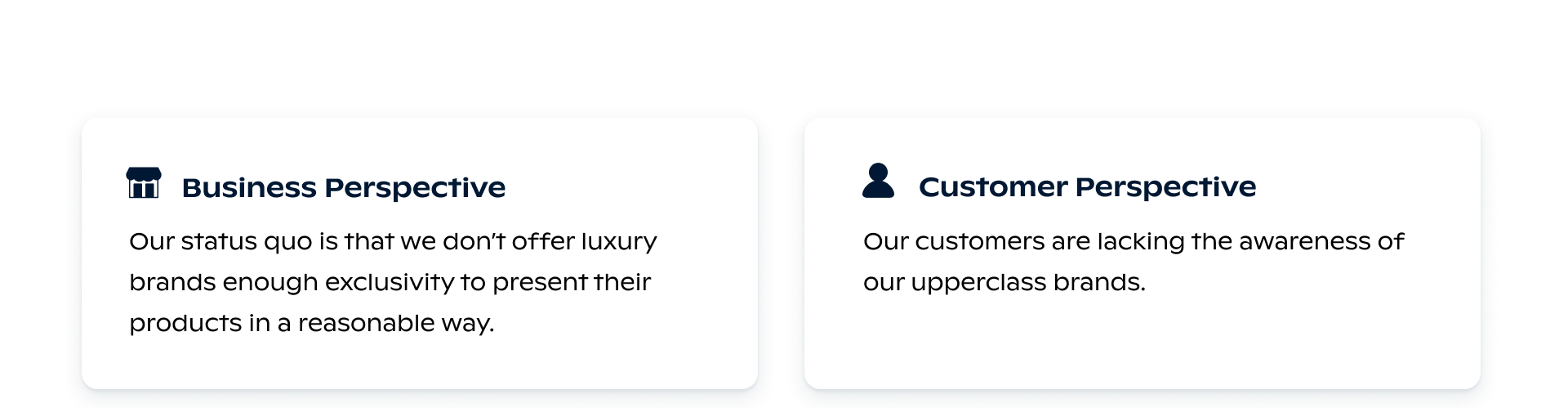
Problem Statement
––––– Objective
BOOSTING THE AWARENESS
The overall objective is to arrive at a desirable, feasible, and viable solution that allows the positioning of exclusive brands at Peek & Cloppenburg Düsseldorf. In order to be more attractive to our customers and to have an answer to changing consumer patterns, a premium section is intended to be integrated for P&C (so-called "Trading-Up"). Fulfilling the needs of our customers is also supposed to help us achieve our ambitious financial goals by 2025.
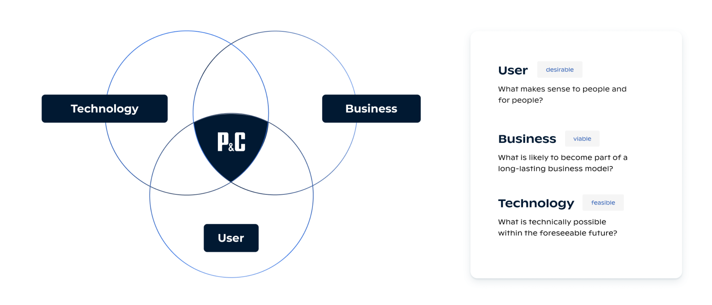
A graph
––––– Understanding& Emphatizing
DEFINING THE TARGET GROUP AND CUSTOMER JOURNEY
We looked at our existing P&C* personas, their values, motivation, and pain points, respectively. The sophisticated Shopping Fan and the young Fashion Activist were chosen as the two main personas because they best represent our desired target audience. Based on the workshop findings, we then created an assumed customer journey to help us empathize even further with our users and build solutions that address their specific needs.
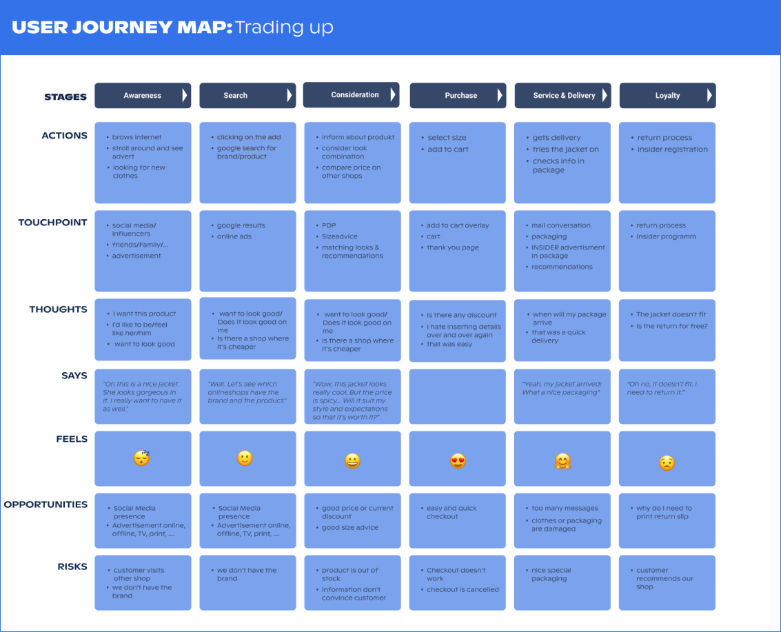
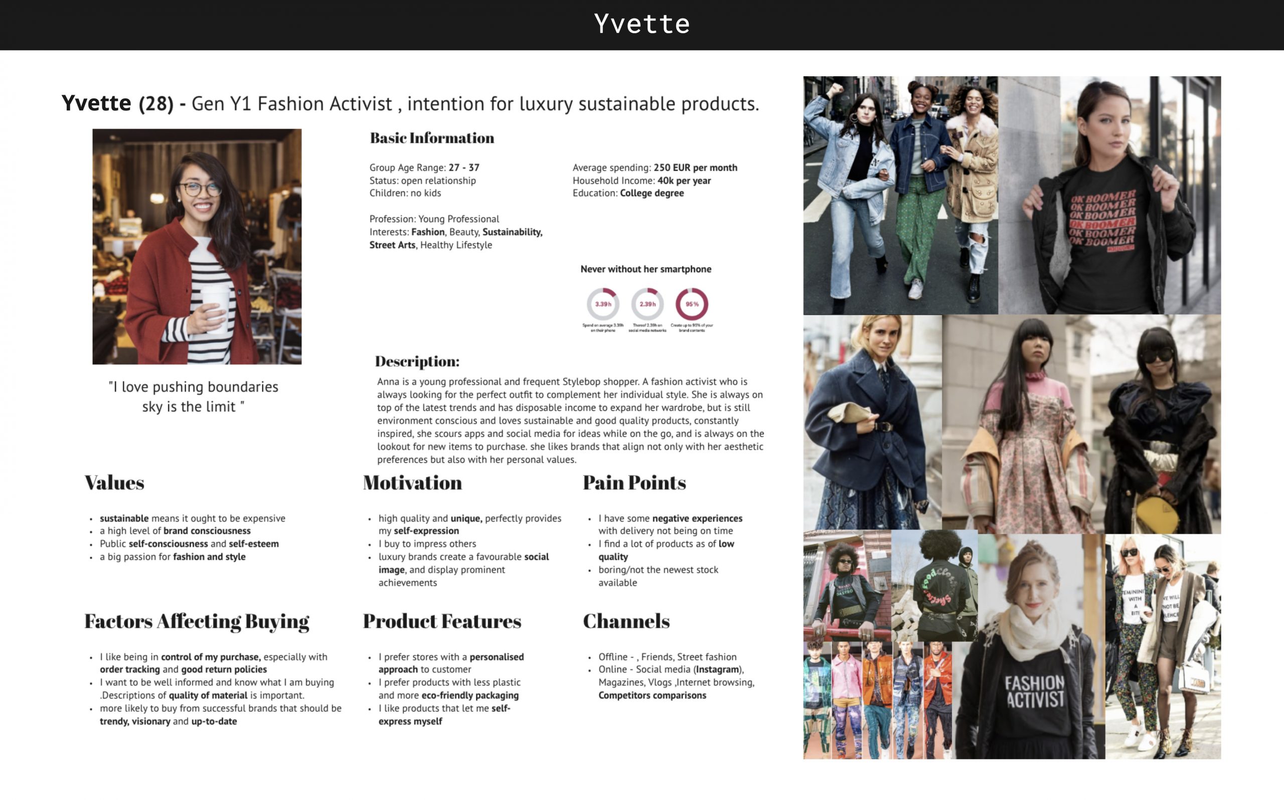
User Persona & User Journey Map
––––– Ideating & Designing
OUTLINING THE USER FLOW AND SKETCHING OUT THE FIRST IDEAS
After we decided on the general user flow, we then started the brainstorming process by sketching low-fidelity wireframes on paper. Initially, we focused on quantity over quality. However, the features crafted would particularly focus on personalized content, greater brand awareness, personal shopping consultation, and luxury integration in our main navigation. We concentrated on these areas as they were the main outcome of the workshop.
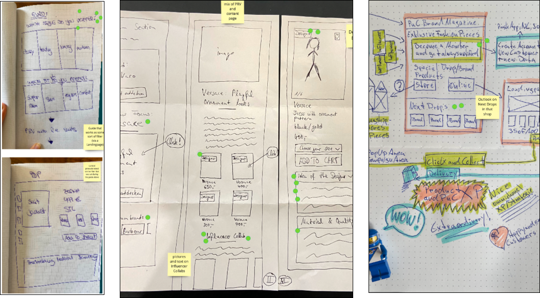
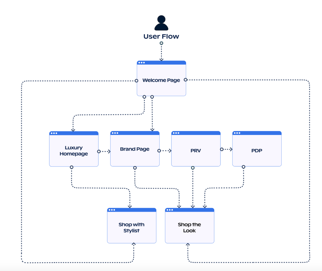
Sketchings and User Flow
––––– Usability Testing & Validating
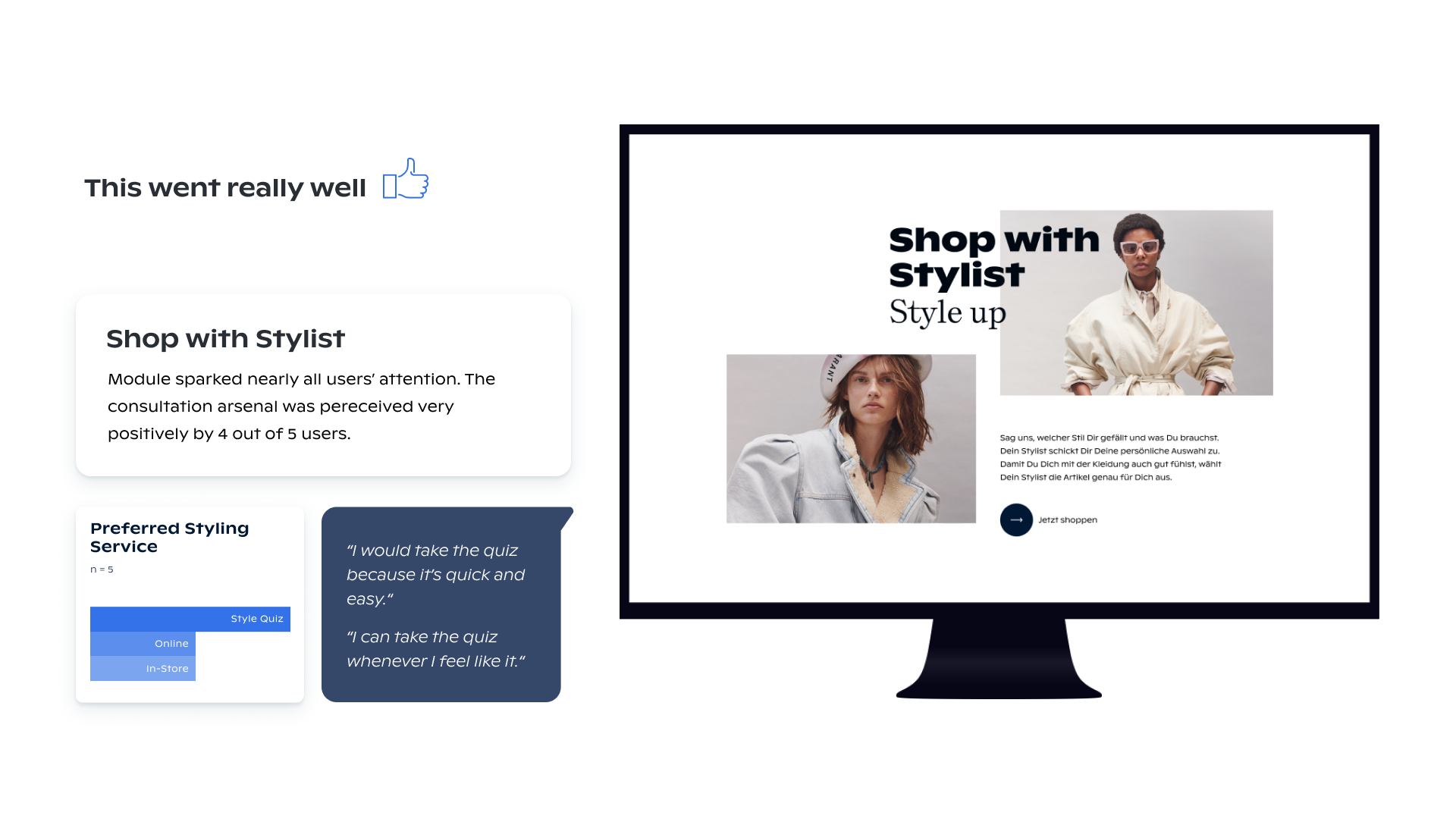
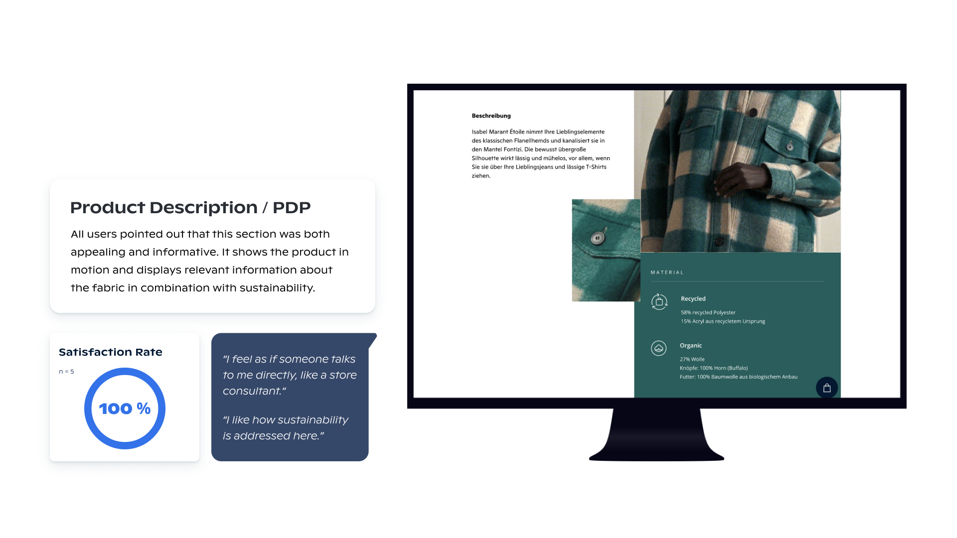
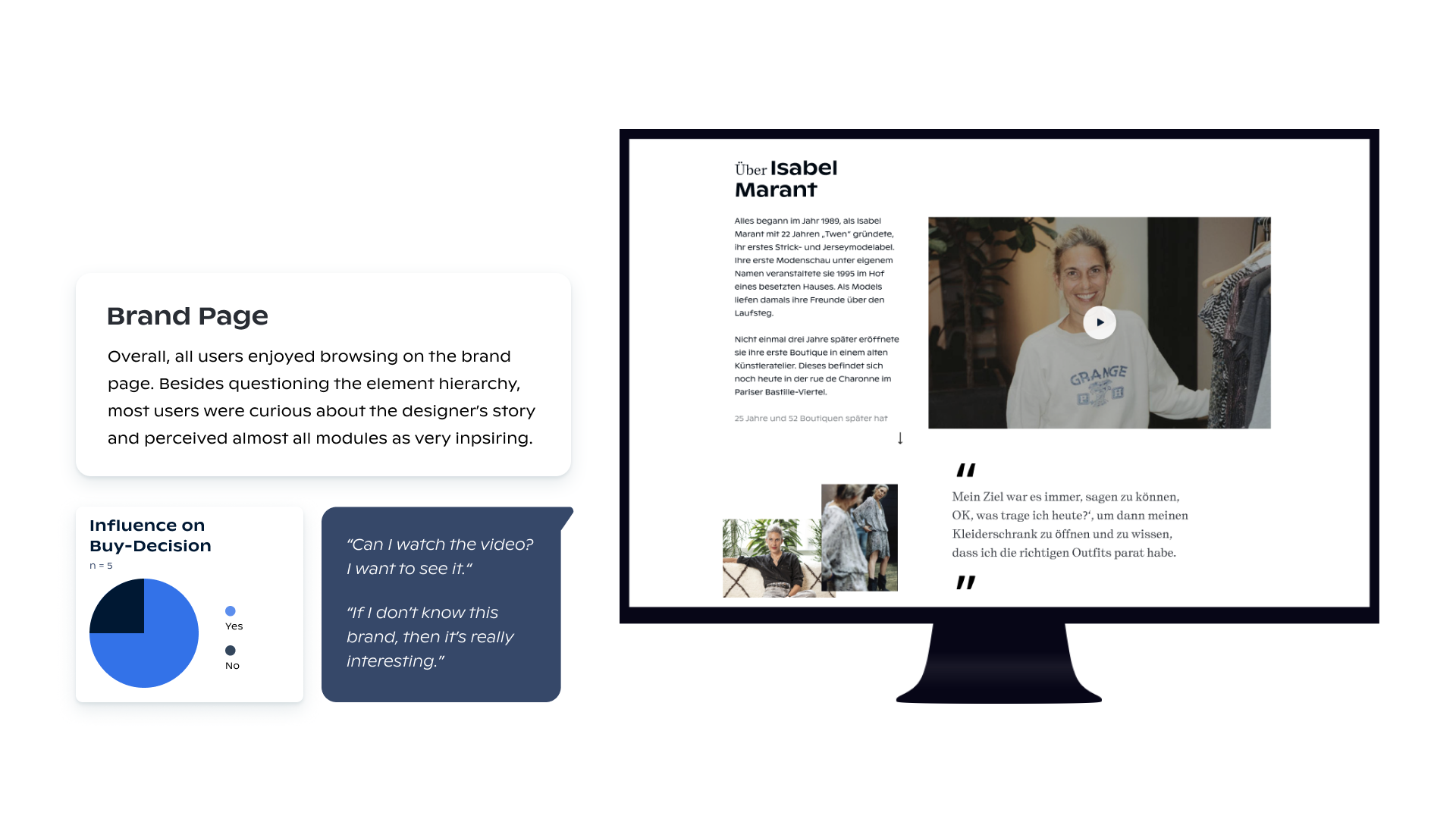
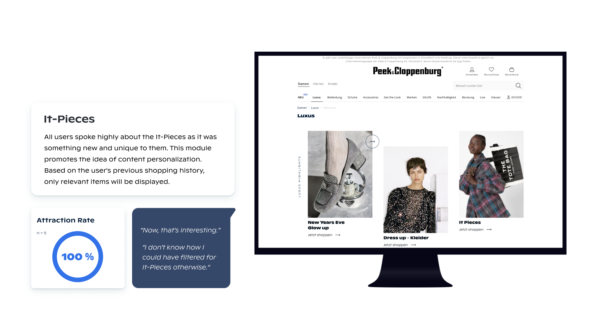
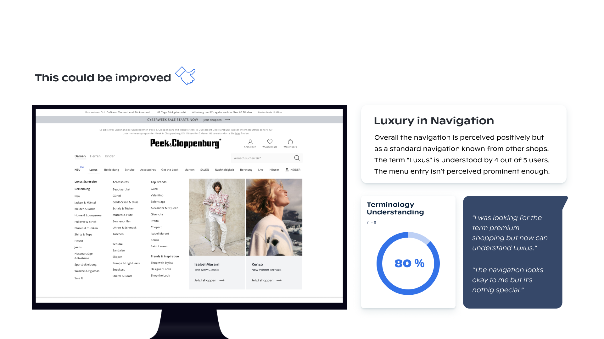
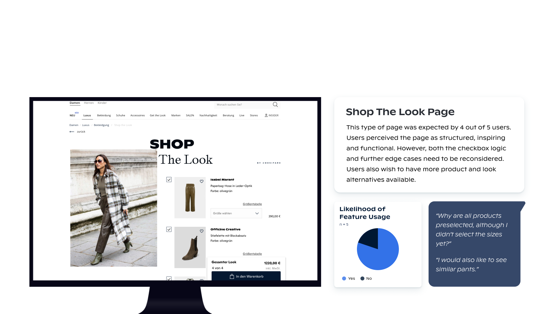
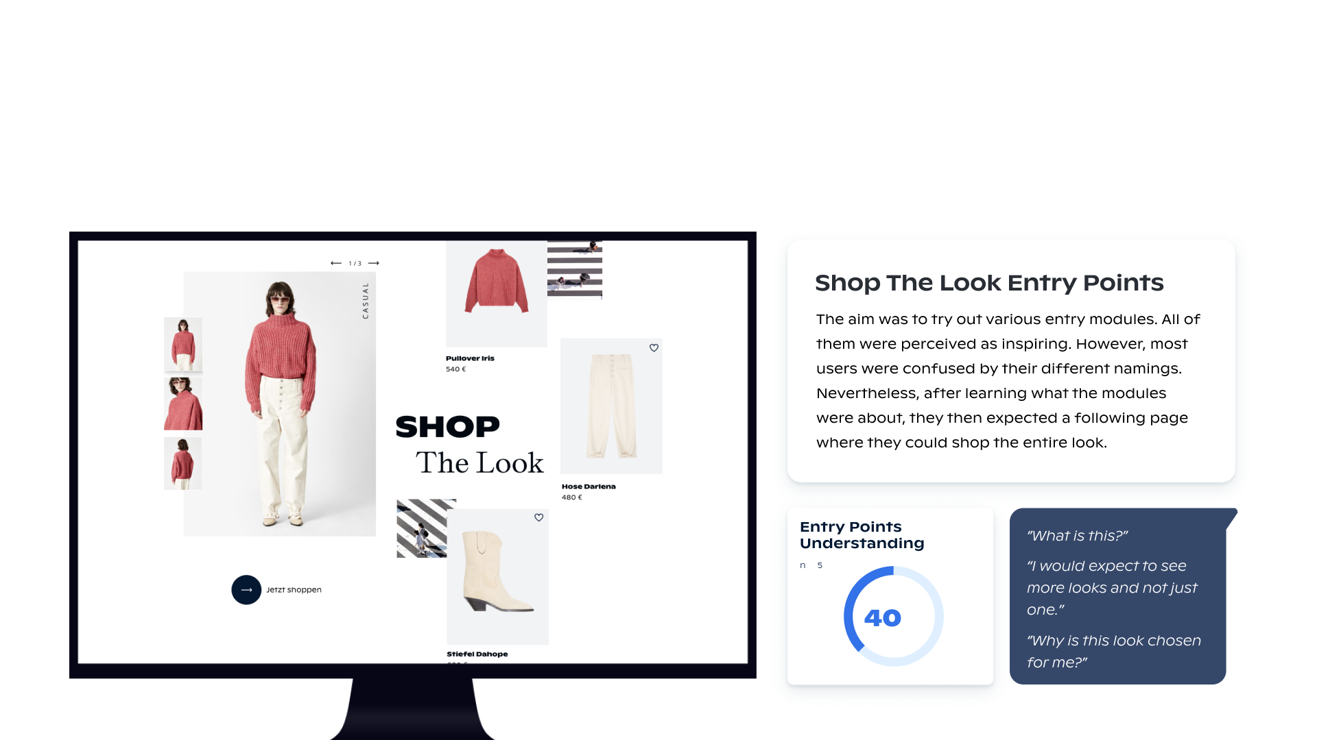
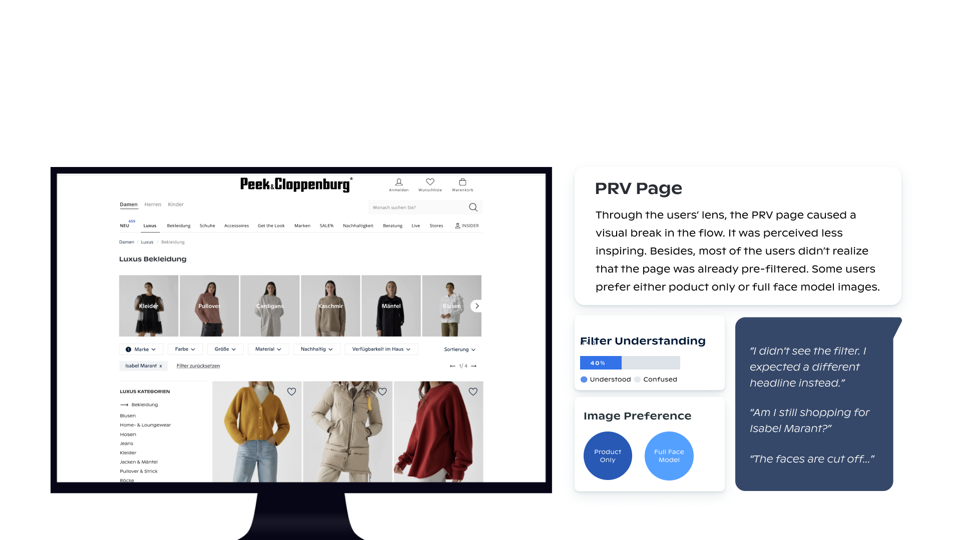
We have virtually tested the prototype with 5 testers aged between 23 and 66. Users were given specific scenarios and were asked to walk through the clickable prototype in a 60-minute half-structured flow. Pertaining to recruitment, we hired an external agency that recruited relevant participants for us based on the provided personas. Next, we evaluated the gathered information using Dovetail and set up a presentation to share the key takeaways and propose the next steps to upper management.
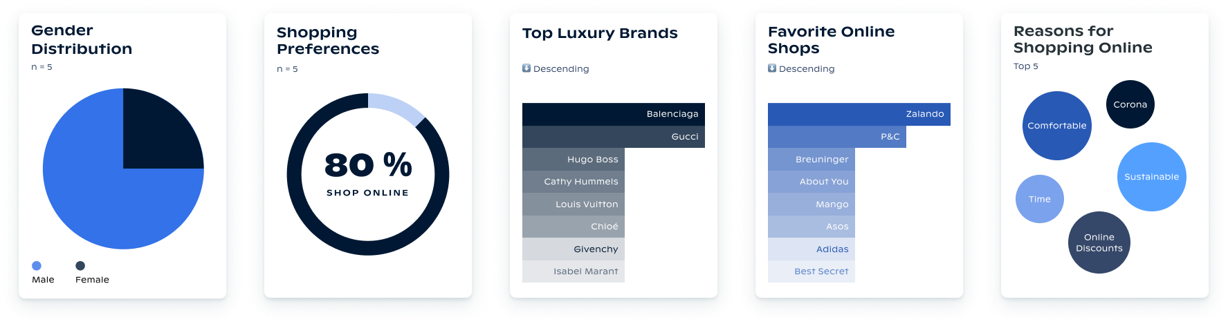
Test Results
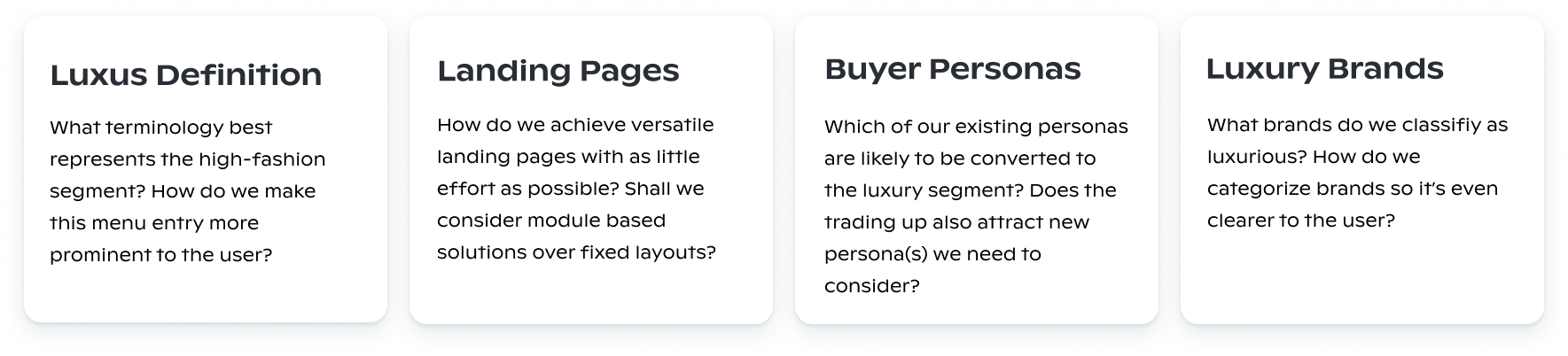
–––––Questions to be asked
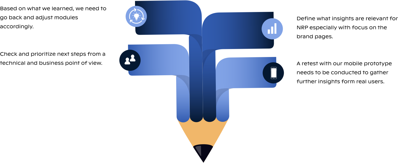
–––––Proposed Next Steps
–––––Learnings
One of the biggest hurdles was that this project took place while we were still operating with our old P&C* online shop, where outdated technology and missing responsiveness limited our design exploration. Nevertheless, we were still able to come up with an intuitive and contemporary solution. Overall, the prototype was perceived as very inspiring and different from what the users experienced before. The insights from the testing were particularly relevant for the business owners in order to define and prioritize the next steps concerning the new retail project we were already working on in parallel.
Selected Works