Finalist of Agrafa Attitudes 2017
––––– Background
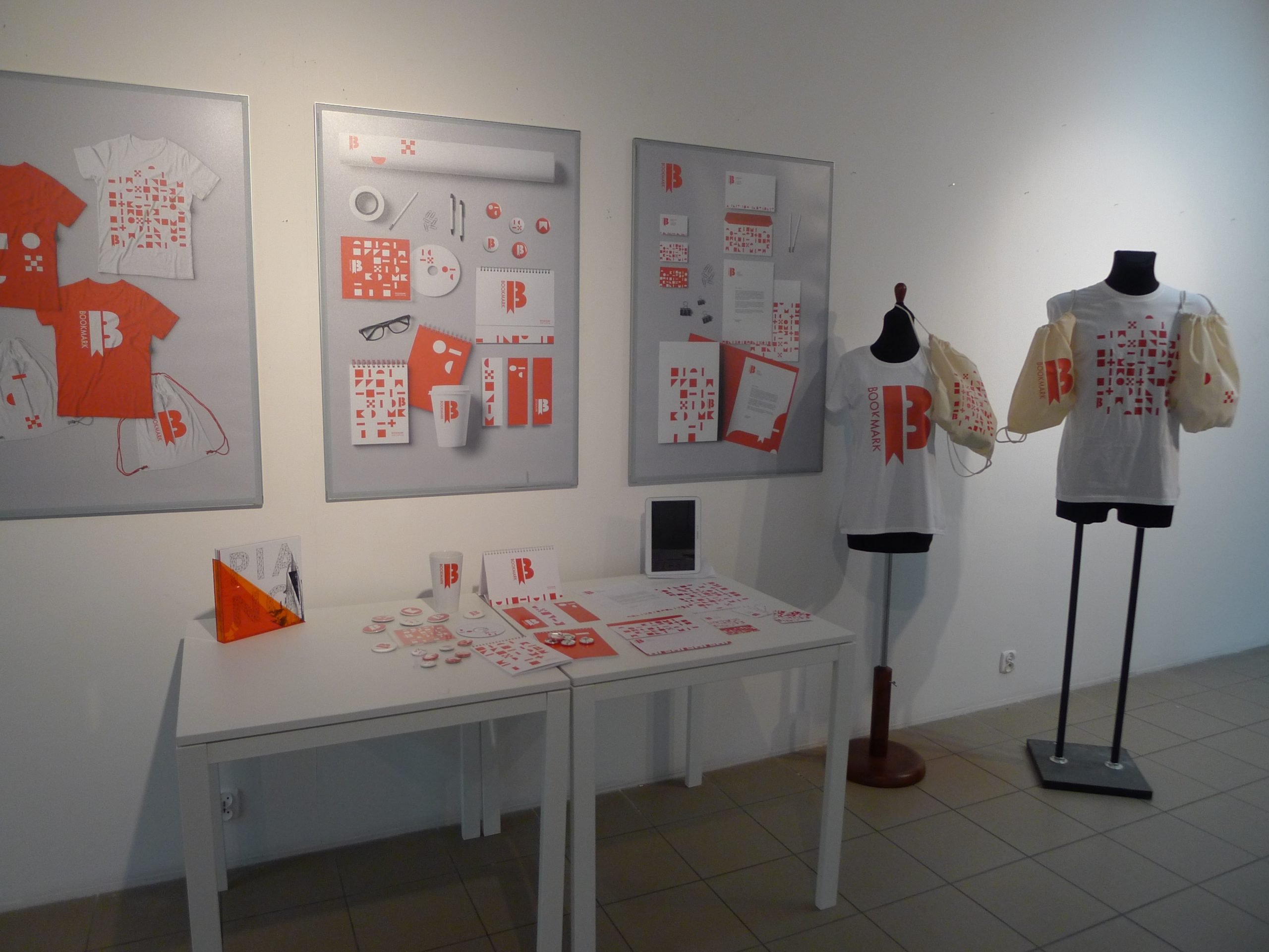
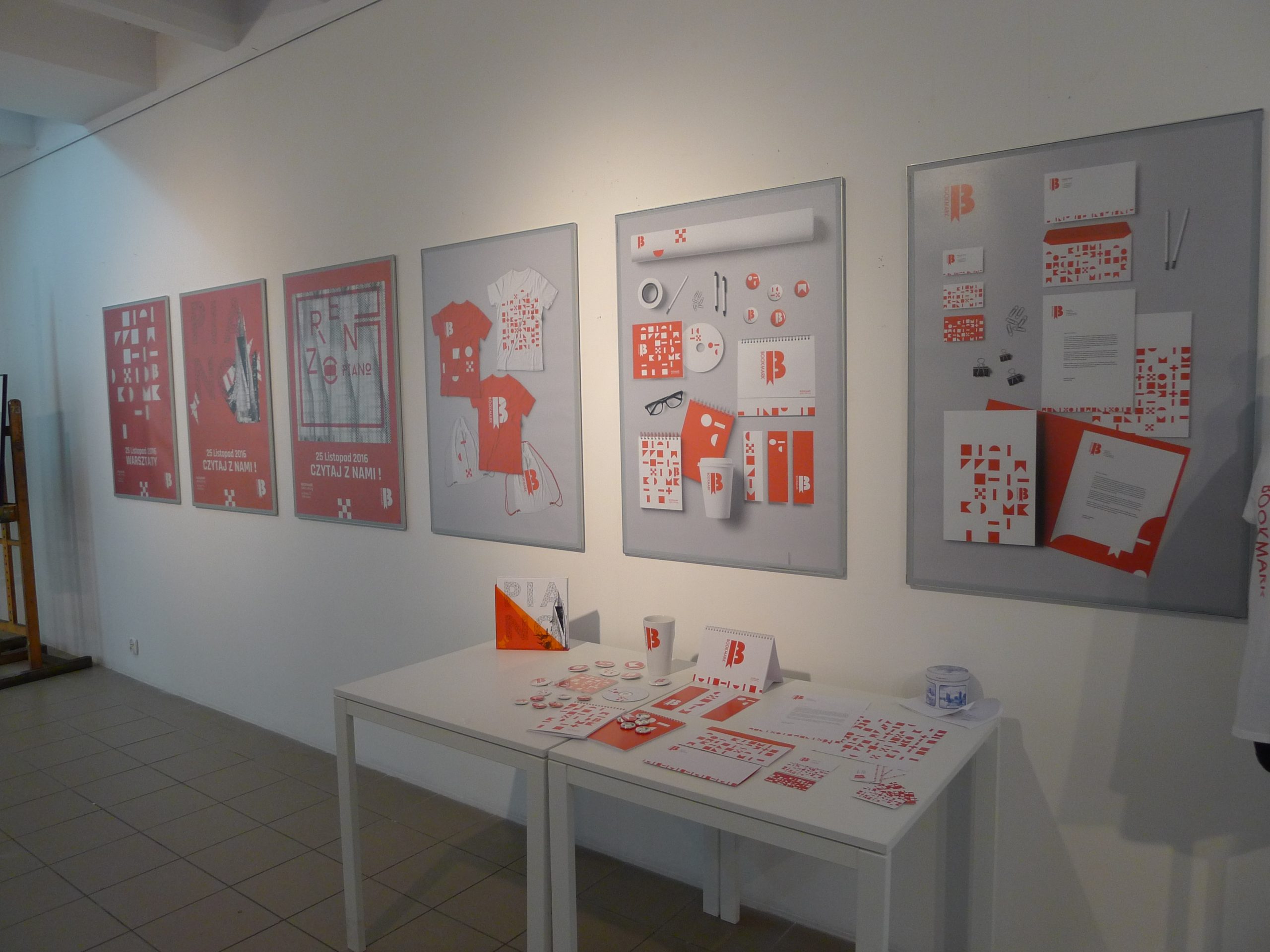
Visual identification of a publishing house 'Bookmark'
Literature stimulates not only the reader’s imagination but also leads to new thoughts and reflections, which often leave a mark on the audience long after reading the book, staying with us even for our whole lives. The name perfectly reflects the nature of the institution. It is automatically associated with reading, and when we split the words BOOK (book) and MARK (mark, sign), we get the second meaning “mark or a trace of the book”. A mark that good literature leaves in our hearts.
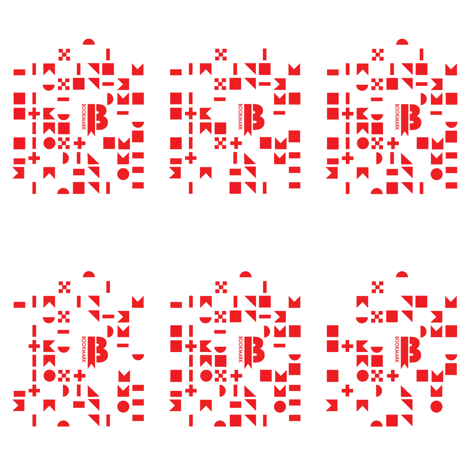
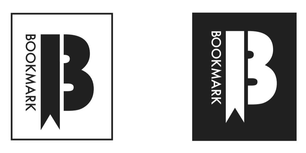
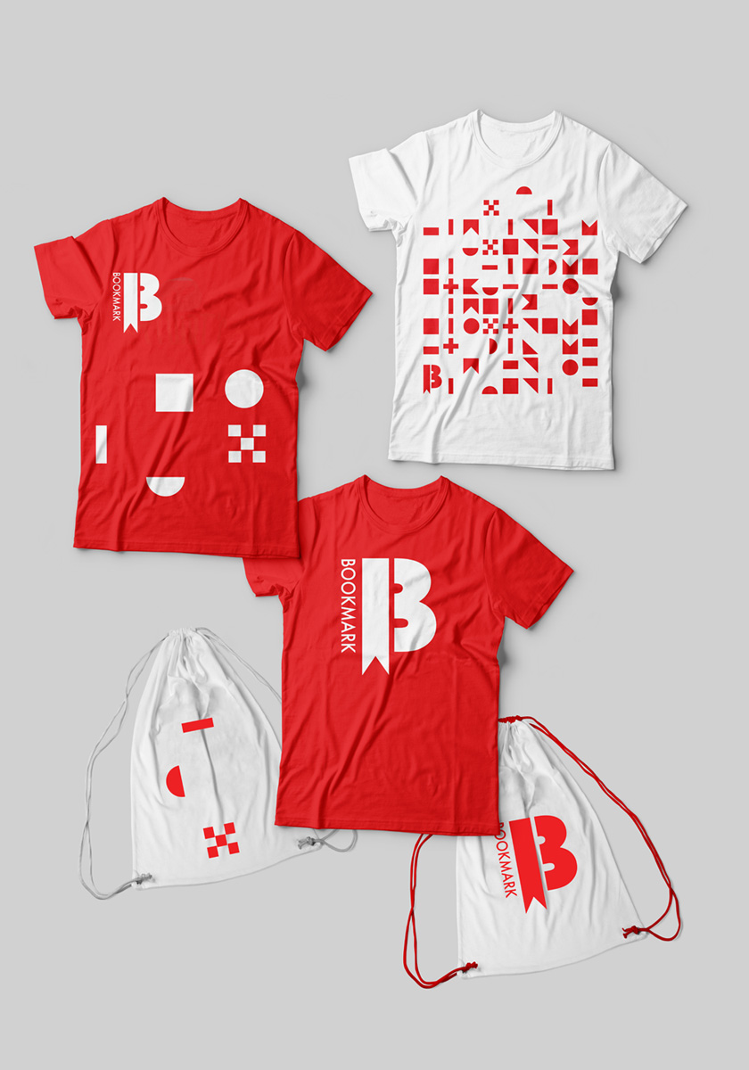
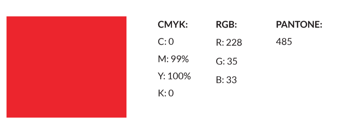
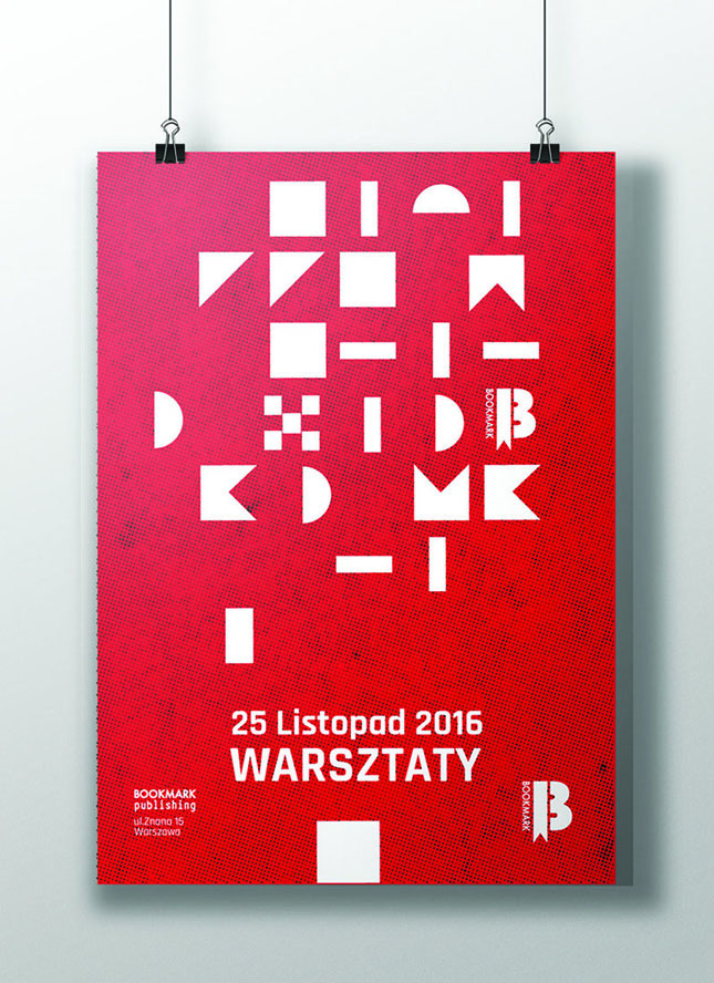
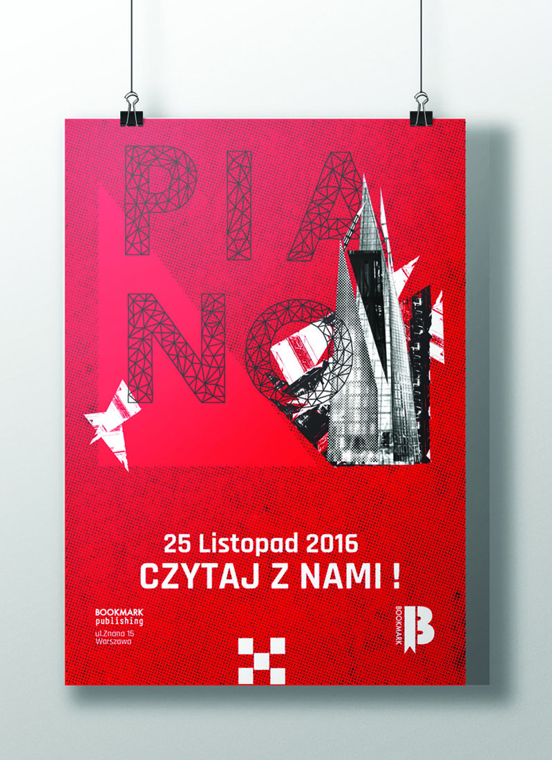
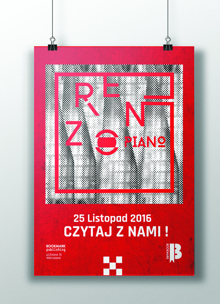
This Logo is very simple. One of its elements forms the shape of a bookmark for the book, and the second resembles a part of a letter B. As a whole, they form the letter B, which is the first letter of the name of the publishing house. The colour- primary red emphasizes the simplicity of the logo, and gives the logo its visual energy, attracting attention, strengthening, and enhancing its visual composition. Bauhaus 93 is the font on the basis of which the logo has been created. This is a very distinctive typeface which is based on the concept of the Bauhaus school - unfinished design. Reading books has something of this unfinished action. Usually, we end up reading not just one book, but when finished, we reach for another one

Selected Works