––––– UX|UI case study · 12 min read
Customers will trust Vodafone solutions to simplify their lives
Vodafone IoT Marketplace
––––– My Role: Product Designer
In an agile and highly iterative process with one User Researcher and two Product Designers, I was mainly responsible for rapid prototyping and user research of parts of the flow and to create a clear and intuitive information architecture
––––– Deliverables:
- Wireframes
- High-Fidelity Prototype
- Usability Testing
- User Flows
- MVP Web App
––––– Tools Used:
- Whimsical
- Figma
- Jira
- Lookback
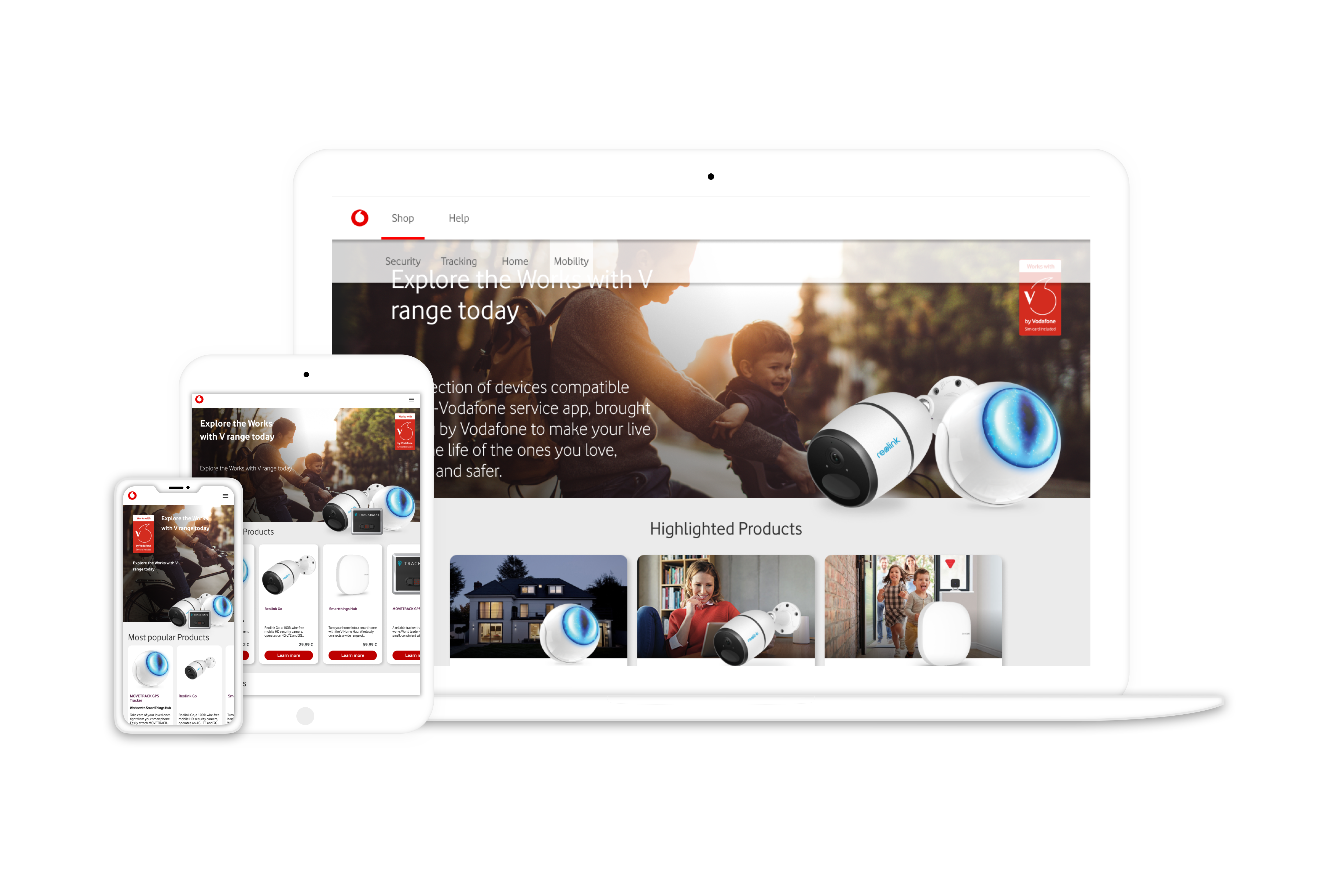
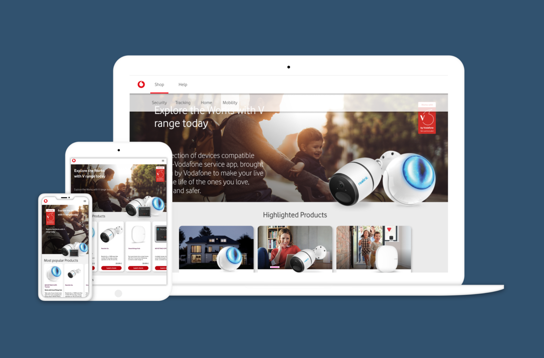
Home page view desktop card tablet and mobile
––––– Challenge
Our main goal was to build Customers' trust in Vodafone IoT solutions that would simplify their lives. To do so, we have set a number of questions we wanted to answer during our design process:
1) Will the content we provide have enough information to inform the purchasing decision & actual purchase? Answer: To inform the purchasing decision to a large extent, yes, but not to buy immediately.
Will we be able to positively influence customers to buy the IoT devices via our platform? Answer: No, not really. We can engage them to do so, but we cannot prevent them from checking other well-known platforms such as Amazon. They will continue searching for similar / cheaper / better-reviewed products on Amazon, etc.
––––– Solution
Plenty of double-checking the information needs to happen before buying; this is why the website we have created provides deeper information on the product. Attention has been paid to the categorization of the products, as well as detailed & expansive information about each product, including, for example, information about the manufacturer in the category mobility screen, etc.
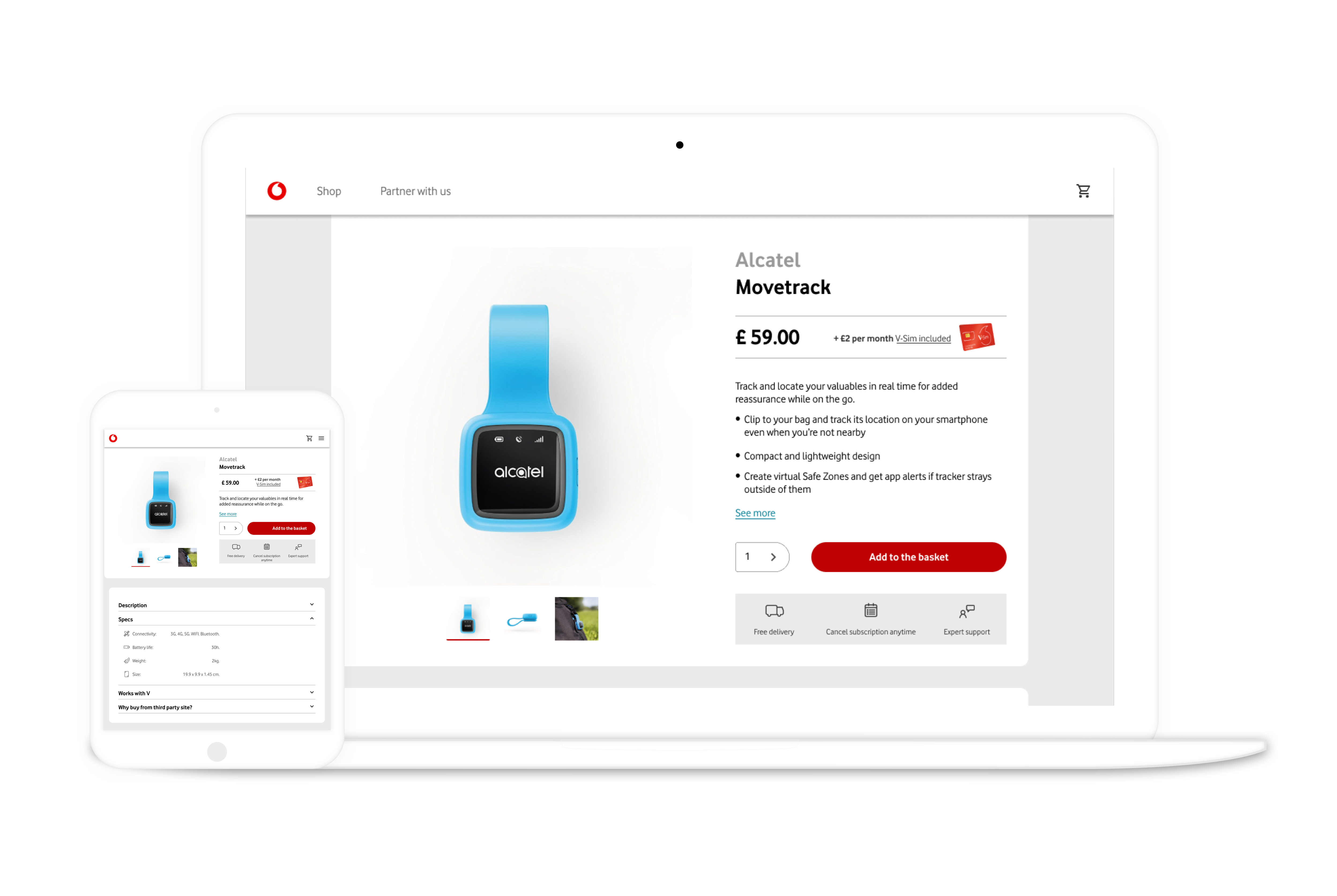
Product card views tablet and mobiles
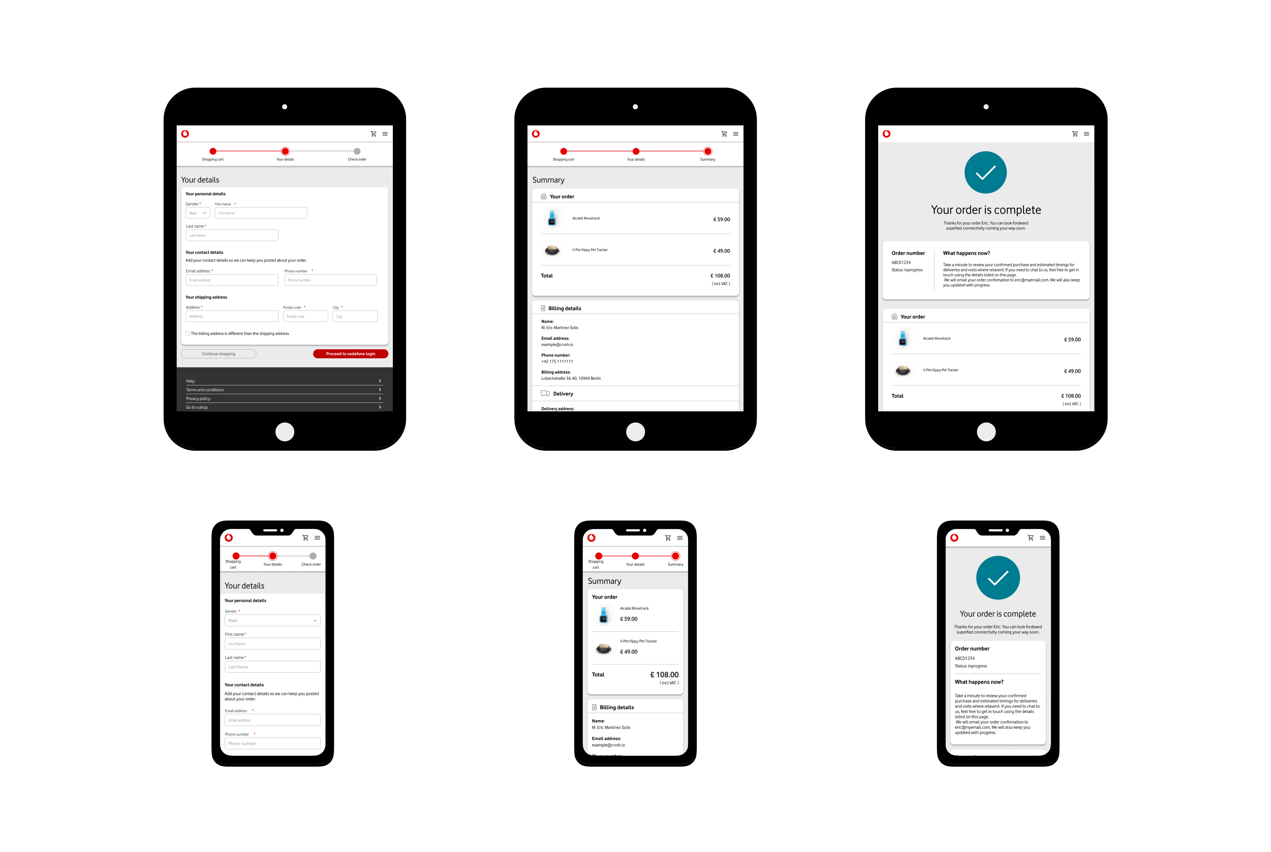
Basket views tablet and mobiles
––––– Mapping the Challenge
The picture below shows how we mapped the challenge. The left side includes the actors involved in the challenge, the right side shows the long-term goal, and everything in between is the steps on how to reach that long-term goal.
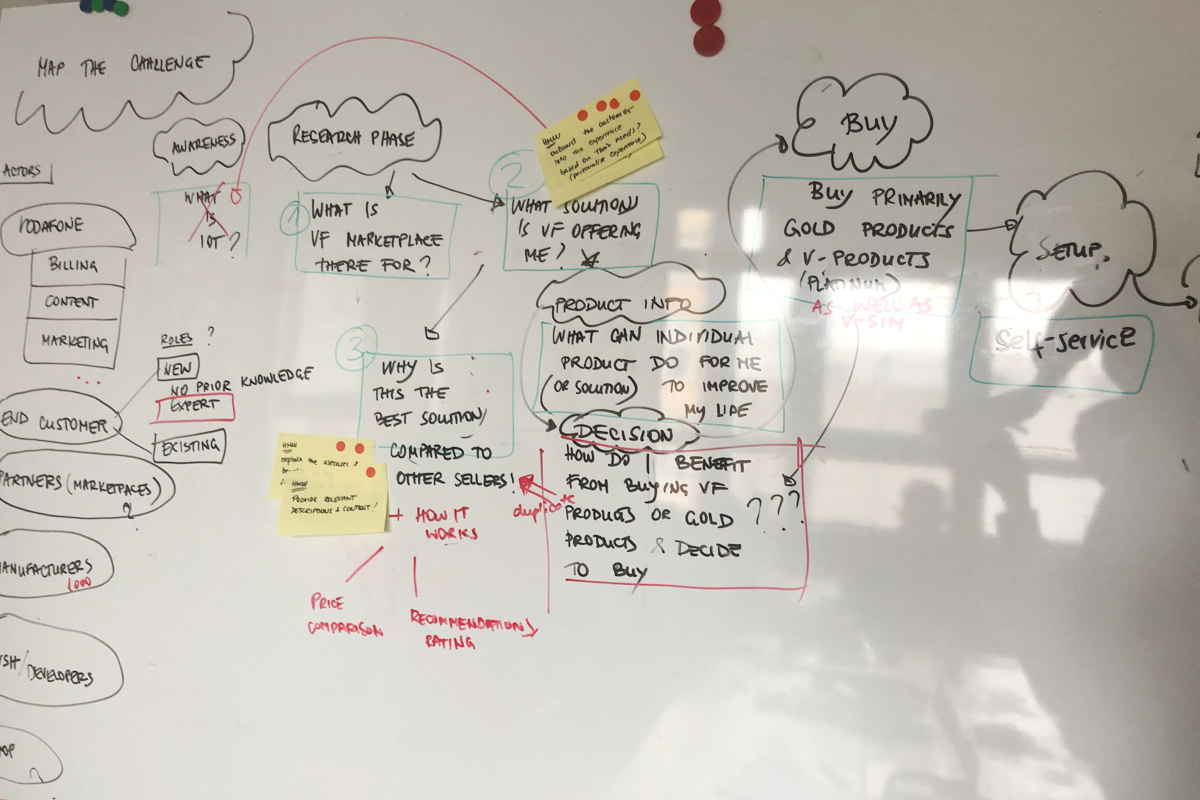
Mapping the challenge
––––– Brainstorming and initial mockups
We took inspiration from our competitive analysis, and took from it the most important message, and did lightning demos, which helped us in the initial sketching of the mockups.
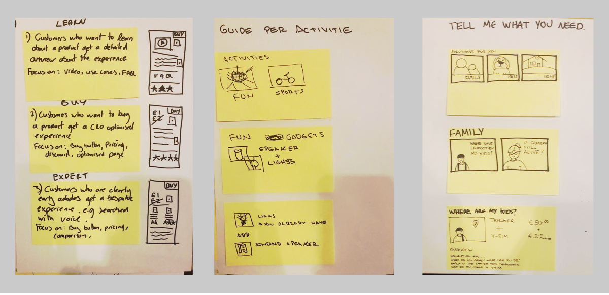
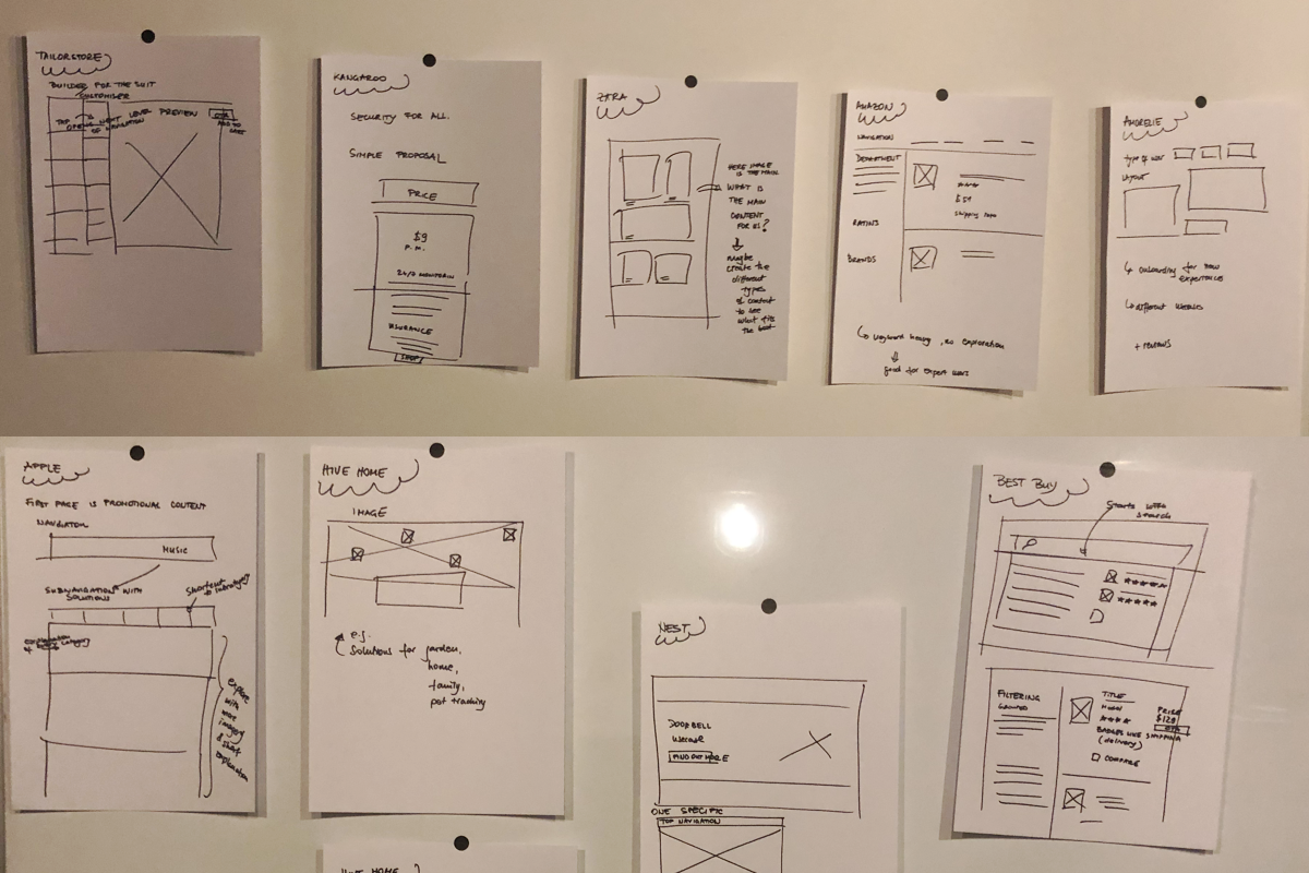
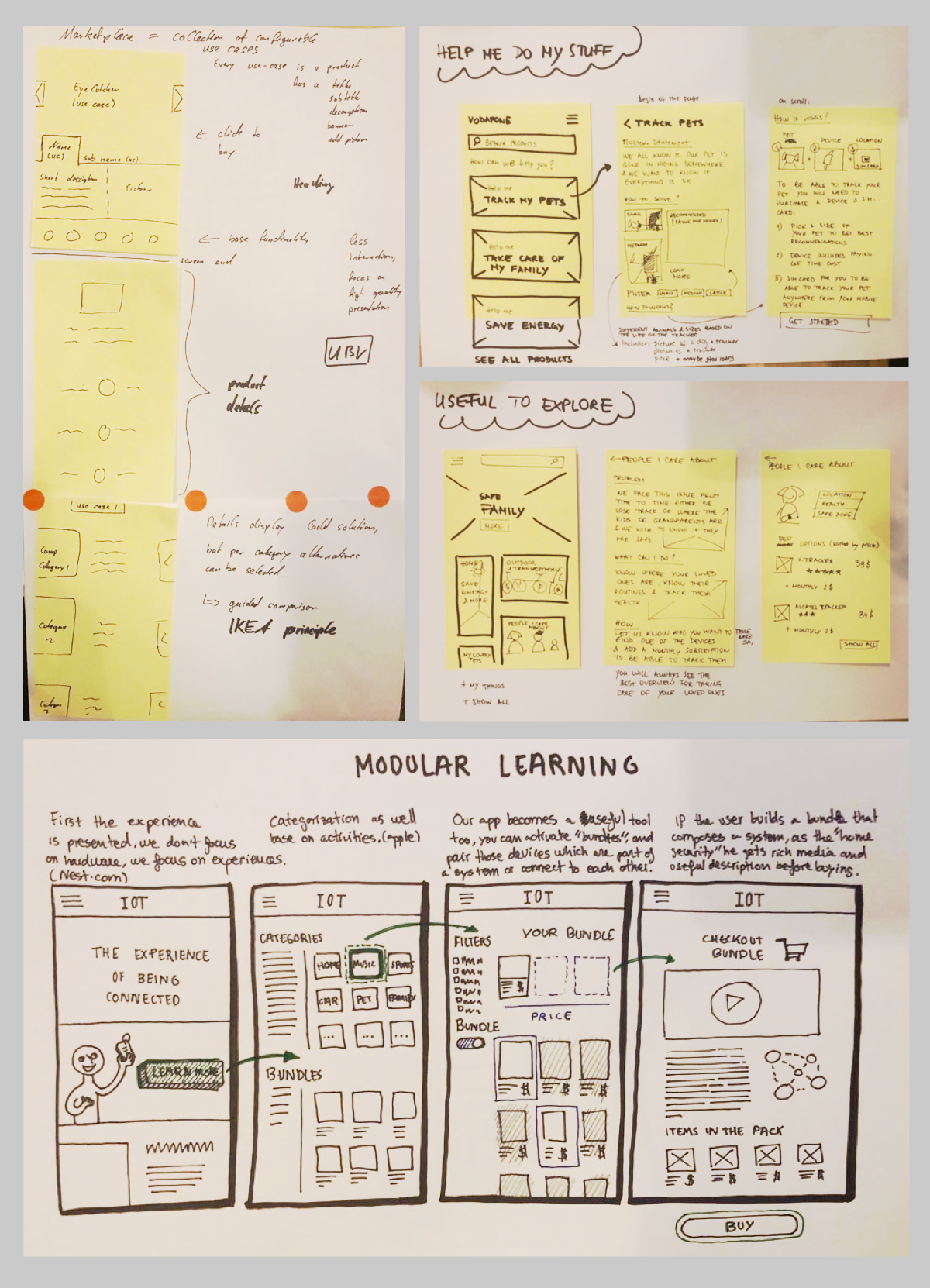
Lightining demos & sketches
––––– Card sorting for categories
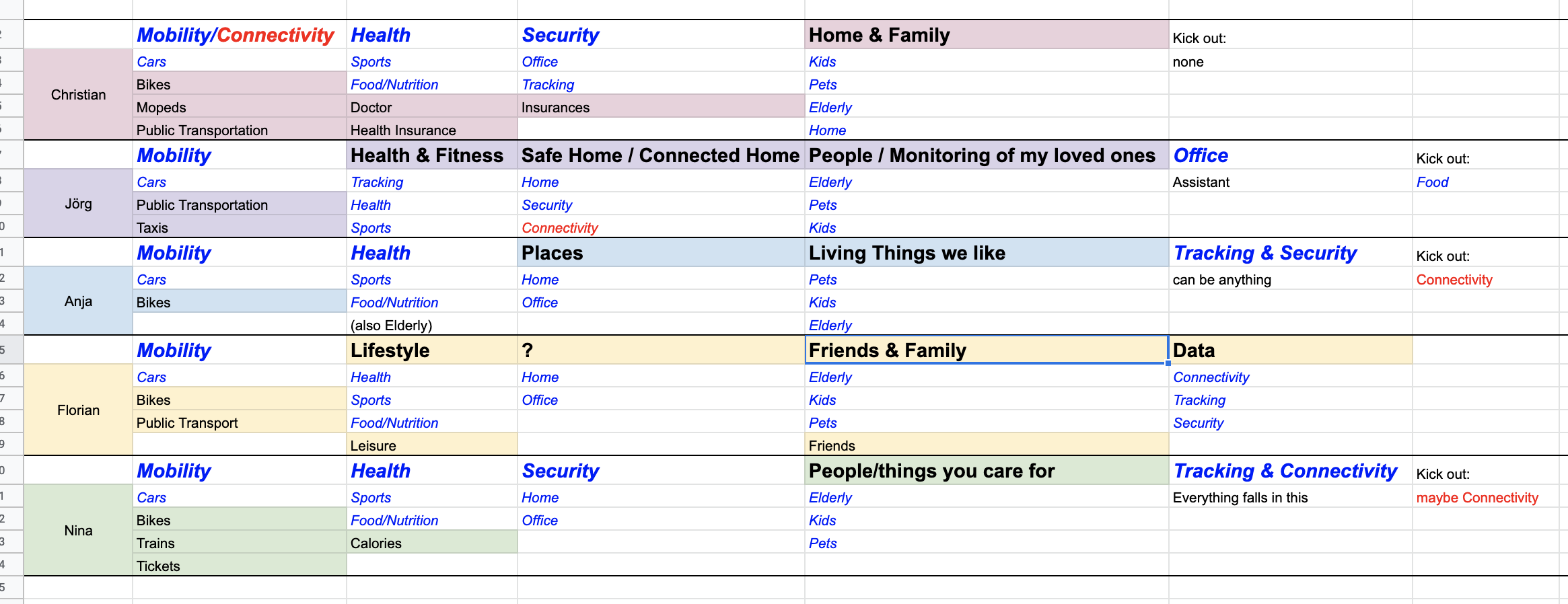
We created 13 fake categories (blue font color in the screenshot below), and we asked the users to group them in the way that made the most sense to them. The users could decide to use all the categories separately or merge them, to give them new titles, or to use one of the fake categories as a title.
Here are the results for the categorization of the website:
- Mobility Category makes sense, and all the users include cars & bikes in it
- Health category includes sports & food/nutrition
- Home & Family includes: Elderly, Pets & Kids
- Security, including products like cameras and alarms for home and office.
––––– Usability Testing
Several usability tests have been conducted. Below are some of the findings
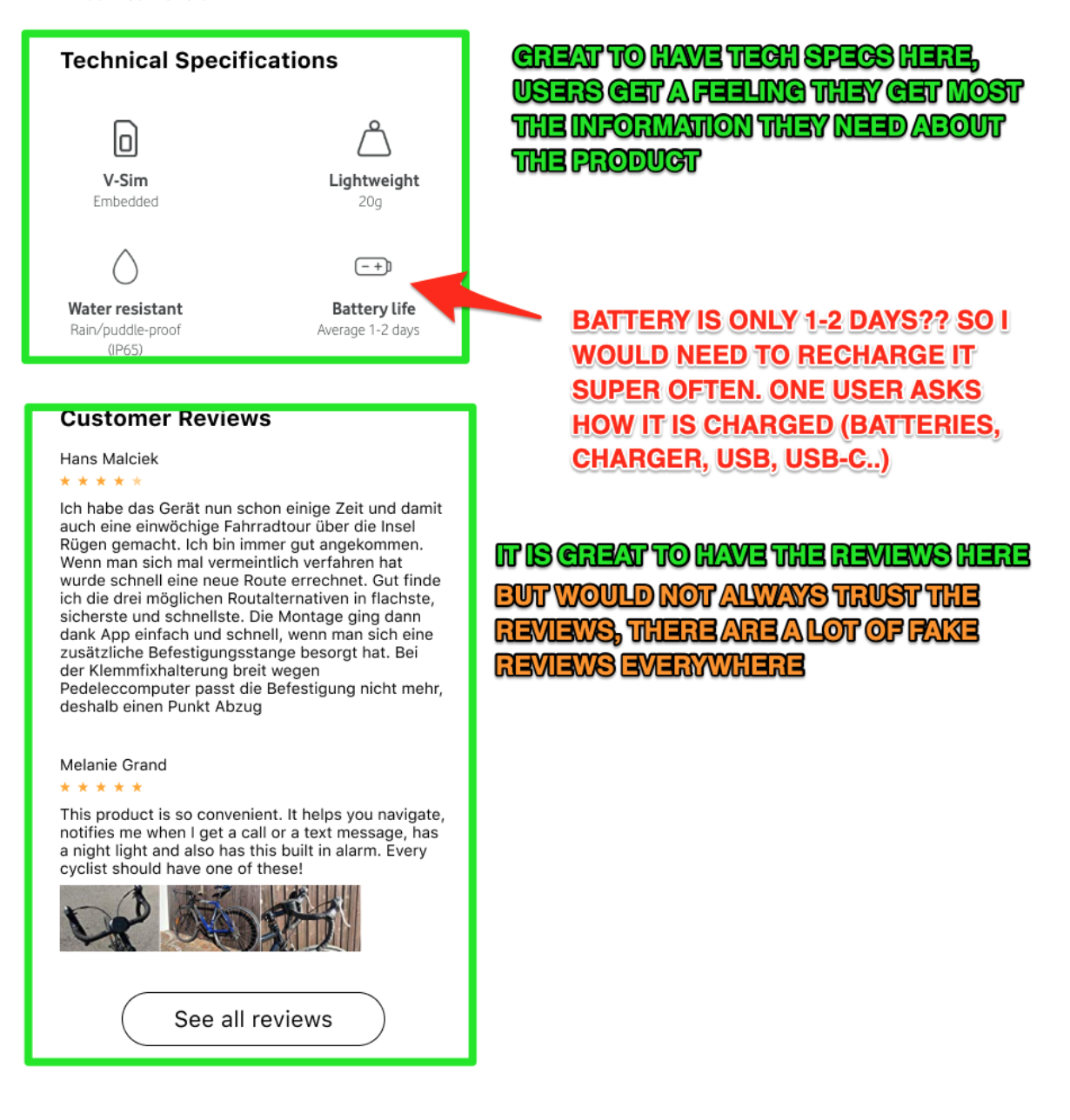
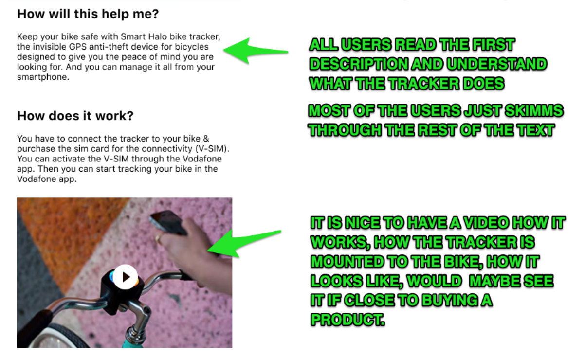
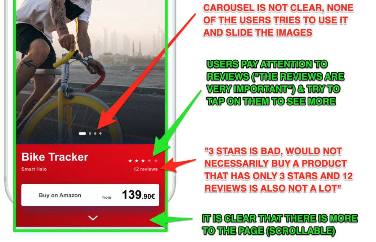
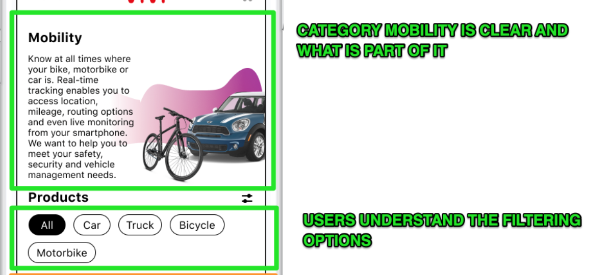
Usability testing findings
Selected Works